Thursday, April 17, 2014

Universal Transverse Mercator (UTM)

 
http://www.dmap.co.uk/utmworld.htm

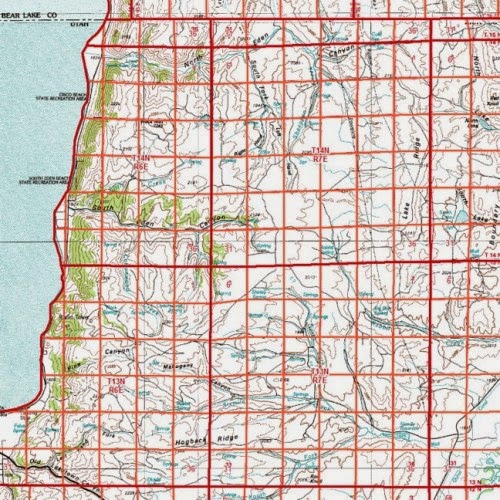
The image above is an example of a universal transverse Mercator (UTM). UTM offer locational information by referencing geographical locations with a coordinate system. The UTM is a rectangular coordinate system, meaning it is map projection (Transverse Mercator) overlain by a grid coordinate system. The UTM must always be georeferenced, as it provides measurements of area and distance across the globe. The UTM cuts the globe into 60 zones, mapping the globe from 80S to 84 N. The map above shows the distance of these zones, it may be a little distorted at higher elevations, but is still the most used rectangular coordinate system in the world.

Public Land Survey System (PLSS)


The map shown above is a good exzmple of a public land survey system, or PLSS. The PLSS is a version of a cadastral map. It is a systematic land partitioning system meant to show land ownership in an area and can also offers locational information. The land is divided up into congressional townships, 36 square acre parcels of land, and are bounded by ranges and townships.

Cadastral Map

 
http://www.spaceage.co.in/cadastral-surveys.php

The map above is an example of a cadastral map. Cadastral maps are similar to planimetric maps, but there main focus is to show property ownership of land in an area. The map above shows the property ownership of homeowners, businesses, and government functions and each property is bounded by land parcel boundaries. The map is a spread showing the land parcel boundaries that establish parcels that are given as property to citizens. Many surveys and GIS processes must be done to create a correct and functional cadastral map; they are important for cities to keep records of property ownership.

Data Visualization

 
http://datavisualization.ch/showcases/the-grammys-visualized-by-the-fans/

The geovisulaization shown above is an example of a data visualization. Data visualizations are highly technical; they are the made in a process of using high-tech computer and numerical applications to create visualizations of data in a abstract way. For example, the visualization above shows the trend in website views and ratings of music artists through the night of the Grammy awards. This kind of modern, and technological way of presenting data is revolutionary to cartographers.

Triangular Plot

 
http://www.dplot.com/triangle-plot.htm

The plot chart shown above is an example of a triangular plot. These plot charts are used majorily for presenting data on soil texture. The three varialbes for the chart are silt, clay, and sand, and percentages are used to measure the degree of the variables. Also, the intersecgtion of data values indicates soil texture type, be it 50% sand, 20% clay, and 80% silt, which would put it in the loam catregory. I could see this map being useful for observing data sets that consist of three variables

Wind Rose Map


The map shown above is an example of a wind rose map. Wind rose maps are a type of geovisulaizations, and have a similar style to the circle plot. Their function is to show the frequencies of different winds in a region. The map above shows wind frequencies in Barrow, Alaska. According to the map, there were strong winds coming from the North and East directions, but weaker winds coming from the South and West directions. A key at the bottom left side of hte map indicates differetn wind strenghts, with red being the strongest and dark blue being the weakest. 

Wednesday, April 16, 2014

Climograph

http://hercules.gcsu.edu/~doetter/courses/geog1112/labs/geog1112_climograph.html
The graph above is an example of a climograph. Climographs are used as geovisualizations and present data values regarding the weather. More specifically, the graphs are used to relate temperature levels to precipitation levels. Like line graphs, climographs measure data values against time. Data values are measured at monthly intervals in one year. The Climograph above shows weather data in America in one year, and it seems that levels increase greatly in the summer months.

Similarity Matrix

http://www.lonestarbands.com/bmi.asp

The map above is an example of a similarity matrix, a method geovisualization. Similarity matrix's are used to measure the similarities between two things. The similarity matrix above shows different body types according to weight and height. A key is offered too explain and distinguish each body type. Proximity of data values show how similar they are to each other.

Star Plots

http://documentation.statsoft.com/STATISTICAHelp.aspx?path=Graphs/Graph/UnderstandingGraphs/Concepts/ConceptualOverviewsIconPlots

The plots above are an example of star plots. Each plots has 6 dimensions, or radii, and the point that is plotted on each radii is a measurement being made against that radii. For instance, the Caribbean island of St. Croix has high point values on three of its dimensions, meaning the data values for those dimensions are high. These dimensions could be measurements of the island's food, beaches, or night life. Star plots are great for comparing multiple variables, like islands, at one time.

Parallel Coordinate Plot

http://vis.lbl.gov/Events/SC07/Drosophila/

The plot chart shown above is an example of a parallel coordinate plot. Parallel coordinate plots plots data values on vertical axis. Data sets are connected at each point, for instance the data set for nine select cells are being shown in the graph above. Parallel coordinate plots are great for exploring relationships between data sets.

Histogram

http://test.cita.illinois.edu/aria/longdesc/longdesc1.php

The map above is an example of a histogram. Histograms are geovisualizations that display data and the frequency of data values. The chart above is a great example of a histogram in that it shows the frequency with which a tree has a certain height. For example, the frequency that a tree is to have a height between sixty and sixty-five feet is about three.

Box Plot

http://connectmv.com/tutorials/r-tutorial/basic-plots-in-r/

The chart above is an example of a box plot. Box plots geovisualizations that present data in a statistical way, They are great for measuring means and medians to data, and observing data value distribution. Also, they are great for comparing multiple data sets. For example, the graph above is comparing data sets taken on every day of the week.

Population Pyramids

http://www.bbc.co.uk/schools/gcsebitesize/geography/population/population_change_structure_rev5.shtml

The graph above is an example of a population pyramid. Population pyramids are used for geovisualization, as they display data regarding a society's population. Specifically, they show the gender and age distribution within the population. The population pyramid above shows data about Mozambique. As you can see there are far more young people than old, an indication that the country's people suffer from lower life expectancy. But the baby boom any equal gender level indicates the population will soon grow.

Scatter Plot

http://allpsych.com/researchmethods/correlation.html

The graph above is the perfect example of a scatter plot. Scatter plots general measure one variable against another variable, unlike line graphs which measure a variable against time. Data points are graphed as dots, and then a trend line is drawn to show the trend in the data as well as the spread of the data. The graph above shows the income level of experienced workers. It shows a positive relationship between the years of experience of a worker and his income level, as the trend line increases toward the right along with data values.

Index Value Plot Graph

http://www.investing-in-mutual-funds.com/time-value-of-money.html

The graph above is an example of an Index Value Plot Graph. With these kinds of graph, variables are plotted against or as a measure of an index value, which is usually a measure of something. For instance, the map of above shows the actual return rates recorded by a company according to its index and is connected by a red line. The blue line shows the return rates if they were more constant. Similarly to line graphs, index value plots show values over a measure of time, as this map shows return rates from 1951 to 2007. This type of map is useful for comparing actual values with expected or measured values.

Lorenz Curve Graph

http://ingrimayne.com/econ/AllocatingRationing/MeasuringIncomeDist.html
The graph above is an example of an accumulation plot, also known as a Lorenz Curve. The Lorenz curve in red shows the disproportional distribution of income in households in America. It visual representation of inequality, as it falls very short of the line of equality in blue that measures equally distributed income across households.

Bilateral Graph

http://www.treasury.gov/press-center/press-releases/Pages/js3033.aspx
The graph above is an example of a bilateral graph. Bilateral graphs are similar to line graphs in that they measure a variable as it changes over a measure of time. The difference is that bilateral graphs chart two variables against time. The graph above shows job growth against unemployment rates. The two seem inversely related, as job growth increases, unemployment decreases, and vice versa. Similarly, the area on the right shows economic recession, and the area on the right shows economic expansion.

Line Graph

http://www.indiabix.com/data-interpretation/line-charts/027001
The graph shown above is an example of a line graph. Line graph shows data variables that have been recorded over some measure of time. Graphs like these are good for showing geographic changes over long periods of time. The graph above, however, is showing an economic change, or profits, over five years. Data points are plotted and then connected on a graph where time is always the x-variable.

Pie Chart


The chart shown above is an example of a pie chart. Geographic information can be displayed as a pie chart, and by doing so it is geovisualized. Pie charts, like the one above, shows data as percentages that add up to a whole 100%. Each category is represented as a slice of the "pie" and has its own color to distinguish it. The chart above shows the lowest percentage as flat and the larger percentages grow taller and taller, better setting them apart from the group. 

Tuesday, April 15, 2014

Multispectral Image

http://www.crisp.nus.edu.sg/~research/tutorial/opt_int.htm

The map above is an example of a multispectral image. A multispecral image i created by satellites with sensors that pick up on different wavelength throughout the spectrum. The sensors can separate transmissions from different parts of the spectrum and make them into bands. These bands are known as multispectral sensors.The different bands can be used to make different images that could be combined to better illustrate a surface detail. The image above using images of soil, greenery,and atmospheric gases to study a growing forest fire.

Sonar Image


The image shown above is an example of a sonar image. Sonar images are taken the same way radar and lidar images are, but instead uses sound waves to capture images. They are ideal for submariners and boats, as they are good for underwater imaging. The image above depicts a boat that is using sonar to see the nearby underwater terrain, both its elevation and topography. The map uses color to distinguish higher and lower depths. The blue is lower depth and the red is higher depths, which are the ones the boater will probably more concerned with.

Lidar Image

https://www.leidos.com/geospatial/modeling/lidar-urban-modeling
The map above is an example of a lidar image. Images taken through lidar is similar to those taken by radar, but are taken using laser instead of radio waves or microwaves. The lasers are created by amplifying light with radiation emissions. The first thing I notice about lidar photographs are their ability to communicate elevations and detail. The color really stands out the image above and I get a good sense of the topography surrounding the mountainous skyscrapers.

Radar Images

http://www.atmos.washington.edu/cliff/coastalradar.html
The image shown above is an example of a radar image. In my own words, radar images are created by using a transmitter to send of waves that bounce of other objects or energy waves. These waves return to the transmitter and are received and measured by the transmitter's antenna. This data is then used to create images and maps that can be used for countless purposes. The map above is a radar image of a tropical storm. The energy of the water within the storm was what reflected the radar waves, and are what is being on the map in green and blue.

Color Infrared Emulsion Photo Map

http://www.nrcan.gc.ca/earth-sciences/geomatics/satellite-imagery-air-photos/satellite-imagery-products/educational-resources/9351
The map above is an example of a color infrared (IR) emulsion photo. This type of map was created by taking an aerial photograph an coating it with light emulsions that are sensitive to light wavelengths that are not visible to the human eye. As such, they are given false color; the map above utilizes false color to allow its viewers to make out its prospects. In the photo, colors are used to differentiate the greenery from the buildings and concrete structures. Things are much more distinguishable in IR maps than in black and white emulsion photos, such as vegetation, water, and concrete. This is definitely true of the photo above, with its red trees and light blue man-made structures.

Black and White Emulsion Photo Map

http://www.ngs.noaa.gov/web/APOS2/image_tut.shtml

The map shown above is an example of a black and white emulsion photo. These photos are a type of aerial photograph and can be used in cartography. They are coated in black and white light sensitive emulsions. This makes them sensitive to the same light wavelengths that the human eye. The image above was taken above a city, and one can make out the three-dimensional features and use it as a map. It shows the landscape as well as the building elevations.

Digital Line Graph Map

http://proceedings.esri.com/library/userconf/proc00/professional/papers/pap691/p691.htm
The image above is an example of a digital line graph map. It is a type of USGS topographic map, meaning it is georectified and derived from aerial photography. DLGs are used to show an areas topography and many other features, such as hydrology, and urban features like highways, telephone lines, and utility lines. DLGs different though, as data on them are presented as digital vector data. Map features are shown as lines, points, and areas and polygons.The map above shows streets and highways and uses color to distinguish the major roads.

Digital Orthographic Quarterly Quad Map

http://proceedings.esri.com/library/userconf/proc00/professional/papers/pap691/p691.htm
The image shown above is an example of a digital orthographic quarterly quad map (DOQQ). A DOQQ map is a type of topographic map that shows the topography of an area. What makes these maps special is that they use the characteristics of an aerial image and  combine it with the geometric characteristics of the paper map. This removes the distortions of the aerial photo and allows it to be better suited to be a flat map. By this means, the map is georectified and orthorectified.. The map above is the DOQQ of an aerial photo of a developing area. I can tell the make-out of all the building and roads, and I can tell that it is a large area that has been squared away to be shown flat as a map.

DEM Map

http://tahoe.usgs.gov/DEM.html
The map shown above is an example of a DEM map. DEMs are examples of U.S. Geologic Survey topographic map. This means that they are georectified and can be used to locate places geographically. DEM are mainly used to show surface elevations, and often use colors and shading to do so. The three-dimensional shape of the rocky land mass in the image above is expressed through pixels and a sufficient resolution.

Monday, April 14, 2014

DRG Map

http://epd372.blogspot.com/2008_02_01_archive.html

The image above is a digital rastor graphic (DRG). DRGs are digitally scanned images of U.S. Geological
Survey (USGS) standard series topographic maps, also known as topos. These topos are created by taking aerial photographs and then using a stereoscope to give them a three-dimensional effect. As such, DRG's show a regions elevation, topography, and surface features. Also, like topos, they are georectified using the UTM and state plane coordinates. This makes them perfect maps for car trips and directions.

Unclassed Choropleth Map

http://garrisonsmapcatalog.blogspot.com/2011/11/unclassed-choropleth-map.html
The map above is an example of an unclassified choropleth map. Similar to the classed choropleth map, the unclassified choropleth map shows areal data that is categorized in groups. However, unclassified choropleth maps can have many, many intervals for categories. There may tens of different categories in the map above, however many shades of red can fit within the maps key.

Classed Choropleth Map

http://hosting.soonet.ca/eliris/remotesensing/bl130lec7.html
The map above is an example of a classed choropleth map. In a classed choropleth map areal units are combined into a smaller number of groups, then displayed as intervals. In the map above, there are 6 classification intervals. The map is showing the life expectancy rates of those in Africa and the Middle East. The intervals being used in this map are quantiles. To me, quantiles is a better way of averaging out the data and displaying all numerical categories.

Unstandardized Choropleth Map

http://support.sas.com/documentation/cdl/en/graphref/63022/HTML/default/viewer.htm#overview-gmap.htm
The map above is an example of a unstandardized choropleth map. These maps are similar the the standardized choropleth maps, except the data is not areally averaged. Categories range from more random numerical sets and are offer different patterns that that of a standardized choropleth map. The map above is showing the population ranges in Europe. The data categories do not give a good representation of the differences in populations within countries.

Standardized Choropleth Map

http://www.geocities.ws/croden256/energyconmap.htm

The map above is an example of a standardized choropleth map. A choropleth map is a map that expresses areal data. The area being observed is always divided by country, state, or county lines. Them map above is of the United States and all the states are bounded by state lines. The data is areally averaged by density, or energy consumption of states by million Btu's. since it is areally averaged, it is also known as a standardized choropleth map.

Flow Map


The map shown above is an example of a flow map. Flow maps show the movement of entities across the earth's surface.The paths of the entities are usually generalized, and give a direction of the entities, not its exact path. Flow maps are also able to show the intensity of the entities, depending on what they are. The map above shows the movement of quarterbacks across the country, depicting the origin in red and the college team in blue. Arrows are also being used to depict the quarterback's destination. This kind of map is good for describing the power of a location.

Range-Graded Proportional Circle Map


The map above is an example of a range-graded proportional circle map. These kind of maps are similar to continuously graded circle maps, they show information through dots that represent numerical data. But instead, they are graded, so the dots only come in the sizes offered by the scale. The scale in the map above is broken down into four categories. It shows the population sizes of some communes in Zurich.

Continuously Graded Circle Map

http://propagandica.files.wordpress.com/2008/11/circlesizeisproportionaltotheamounteachcountysleadingcandidateisahead.jpg

The map shown above is an example of a continuously graded circle map. This kind of map uses dots to represent data, but the dots can come in all sizes. The map above is showing the campaign efforts of Obama and McCain in the United States presidential elections. Each dot and its size represents the impact Obama (blue) or McCain (red) had on a county in America.

Dot Density Map

http://hosting.soonet.ca/eliris/remotesensing/bl130lec7.html
The map shown above is an example of a dot density map. A dot density map is a type of point pattern map that uses a point, in this case a dot, to represent data. The map above offers data about the united states and its number of cities. Each red dot represents a city. Some dots are clustered together while others are dispersed or even randomly placed. Information on how points are dispersed are useful for researches and studies.

Isobaric Map


The map above is an example of an isobaric map. Isobaric maps are a type of contour map that shows the three-dimensional change is elevations of air pressure on the earth's surface. The map above is linking areas of the same air pressure together over the United Kingdom. Red contour lines represent higher air pressure. Blue contour lines represent lower air pressures. In the middle of the map we see the blue low pressure contour lines closing in on one-another. This is demonstrating the rapid decrease in air pressure taking place over that area. 

Isotach Map


http://www.hpc.ncep.noaa.gov/research/mcs_web_test_test_files/Page1947.htm
The map shown above is an example of an isotach map. An isotach map is a type of contour map that is used by meteorologists to illustrate different wind speeds in an area. The map above shows different winds speeds in America, and the contour lines connect areas of equal wind speeds together. The regions in green have lower wind speeds, such as the south-east, whereas the areas in yellow and red have higher wind speeds, such as the north and mid-west. These areas are more likely to receive weather changes, and isotach maps allow meteorologists to better perceive these changes.

Isopach map

http://www.kgs.ku.edu/PRS/Coal/mineral.html

The image shown above is an example of an isopach map. An isopach map is a type of contour map that shows levels of thickness the rock or sediment in an area. The map above is showing the thickness of mineral coal in a region of America. The map uses both contour lines and color to differentiate the the mineral thickness and show the rate of change of thickness. The structure of the mineral deposits are very linear, as shown by the path of the contour lines. The blue regions have a thinner layer of mineral coal, and are shown in the Chautauqua and Elk region. The green regions have thicker mineral coal region and is dominated by the Montgomery, Labette, Neosho, Crawford, and Wilson regions.

Sunday, April 13, 2014

Isohyet Map


The map shown is an example of a isohyet map. An isohyet map is a type of contour map that shows the levels of rainfall an area receives. This map uses contour lines that, in this case, join areas that receive the same level of rainfall to one another in China. The distance between contour lines defines the rate of change between the two areas. For example, the contour line labeled "90" that wraps around the middle region is at times close to the contour line labeled "60" at the upper region. That means that there is a large change in the amount rainfall over a short distance. The map also uses color; areas that receive more color are a brighter green, while those that receive less rain are a more pale green color. 

Bathymetric Map

http://soundwaves.usgs.gov/2007/05/
The map above is an example of a bathymetric map. A bathymetric map is a type of contour map that shows the elevation, or relief, of the seafloor. In the picture above, the seafloor near the island of Puerto Rico is illustrated through the use of colors as well as shading. We can see the ruggedness of the underwater cliffs and sense the differences in depth of different areas with the different colors. It shos rifts, fault systems, and flow grooves that makeup the seafloor.

Topographic Map


The map above is an example of a topographic map. A topographic map that communicates three-dimensional information about a region, such as its landscape, topography, and geological composition. The map above displays relief of Australia using shading, and shows the differences of earth material with the use of colors. To me, the shading gives the region texture. The edges of the continent has a rougher texture, thus a more rocky edges probably lined with cliffs. The middle area is a smoother texture with light brown color, showing that is flat and more desert-like. 

Planimetric Map


http://www.stockmapagency.com/Political_Map_France_C-Fran-2007-Pol.php
The map shown above is an example of a planimetric map. A planimetric map is a map that shows no topography or physical relief. It only displays two-dimensional information about a region or area. Maps like these are generally used as street maps, they are overly generalized and often leave out certain things to better suit the purpose of the map. The map above is a planimetric map in that it shows no relief. It shows France and its neighbors, but leaves out any physical properties, and only shows major highways, cities, and borders.

Internet Map

http://www.cheswick.com/ches/map/gallery/
The map shown above is an example of an internet map. Internet maps are used to show the size and growth of the World Wide Web in cyber space. They can illustrate the distance and similarities shared between different sites. Also, they use scale to demonstrate the size of the internet, which the map above certainly does. The map above is an internet map in that it shows a layout of all the major ISP's in the internet. Different colors are used in order to distinguish different ISP's from each other.

Cartogram

http://geo-mexico.com/?p=1260
The map shown above is an example of a cartograph. Cartographs are maps that have been distorted in some way to depict a certain variable. The map above of Mexico has been distorted to present the population sizes of different cities within the country. The country is colored in dark blue, a contrast against its neighboring yellow countries.  City boundaries have been enlarged to depict the size of that city, for example, Mexico's large size i proportionate to its large population size. In contrast, cities of a smaller size on the map, like Monterrey, has a smaller population.

Statistical Map


The map shown above is an example of a statistical map. Statistical maps are more focused with presenting hard data and statistics for scientific purposes. The map is showing categories as being either generative or reproductive, and whether they are project based or infrastructure based. The map uses an axis to categorize the subjects and allows subjects to overlap, showing their relation and similarities. The size of the bubbles representing the subjects is a description of the size of each subject, and its impact on society.

Digital Map

http://datenform.de/mapeng.html

The map above is an example of a digital map. It is similar to the maps used by Google maps for driving directions. Digital maps like these are similar to planimetric maps, but allows for less generalizations to be made on the maps. It can demonstrate distance between places, and the scale can be changed to better both the extent and the grain of a location. This increases the clarity of the map, and makes it appear more realistic, as it shows buildings, greenery, and streets with their intersections. While maps like these are general advantageous, they are highly technical, as well as expensive to develop.

Mental Map

http://learningfundamentals.com.au/resources/

The map above is known as a mental maps. Mental maps are highly abstract, and are used as representations of the real world and our perception of that world. It can be an illustration of a single concept, multiple concepts, or of different locations and their spatial properties. Mental maps also show relationships between different objects or ideas, for instance, the maps shown above shows someone's idea of health and all the things that affect one's health, such as sleep, diet, and stress. This map is a mental map and takes the form of "mind mapping", a method that uses branches to show the different ideas that go with or behind a single concept. Both map types are highly abstract and pertain to human experience.