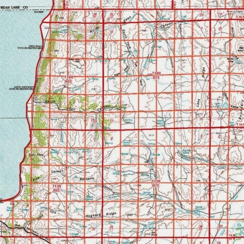
The image above is an example of a universal transverse Mercator (UTM). UTM offer locational information by referencing geographical locations with a coordinate system. The UTM is a rectangular coordinate system, meaning it is map projection (Transverse Mercator) overlain by a grid coordinate system. The UTM must always be georeferenced, as it provides measurements of area and distance across the globe. The UTM cuts the globe into 60 zones, mapping the globe from 80S to 84 N. The map above shows the distance of these zones, it may be a little distorted at higher elevations, but is still the most used rectangular coordinate system in the world.
Map Analysis
Thursday, April 17, 2014
Universal Transverse Mercator (UTM)
The image above is an example of a universal transverse Mercator (UTM). UTM offer locational information by referencing geographical locations with a coordinate system. The UTM is a rectangular coordinate system, meaning it is map projection (Transverse Mercator) overlain by a grid coordinate system. The UTM must always be georeferenced, as it provides measurements of area and distance across the globe. The UTM cuts the globe into 60 zones, mapping the globe from 80S to 84 N. The map above shows the distance of these zones, it may be a little distorted at higher elevations, but is still the most used rectangular coordinate system in the world.
Public Land Survey System (PLSS)
The map shown above is a good exzmple of a public land survey system, or PLSS. The PLSS is a version of a cadastral map. It is a systematic land partitioning system meant to show land ownership in an area and can also offers locational information. The land is divided up into congressional townships, 36 square acre parcels of land, and are bounded by ranges and townships.
Cadastral Map
The map above is an example of a cadastral map. Cadastral maps are similar to planimetric maps, but there main focus is to show property ownership of land in an area. The map above shows the property ownership of homeowners, businesses, and government functions and each property is bounded by land parcel boundaries. The map is a spread showing the land parcel boundaries that establish parcels that are given as property to citizens. Many surveys and GIS processes must be done to create a correct and functional cadastral map; they are important for cities to keep records of property ownership.
Data Visualization
The geovisulaization shown above is an example of a data visualization. Data visualizations are highly technical; they are the made in a process of using high-tech computer and numerical applications to create visualizations of data in a abstract way. For example, the visualization above shows the trend in website views and ratings of music artists through the night of the Grammy awards. This kind of modern, and technological way of presenting data is revolutionary to cartographers.
Triangular Plot
The plot chart shown above is an example of a triangular plot. These plot charts are used majorily for presenting data on soil texture. The three varialbes for the chart are silt, clay, and sand, and percentages are used to measure the degree of the variables. Also, the intersecgtion of data values indicates soil texture type, be it 50% sand, 20% clay, and 80% silt, which would put it in the loam catregory. I could see this map being useful for observing data sets that consist of three variables
Wind Rose Map
The map shown above is an example of a wind rose map. Wind rose maps are a type of geovisulaizations, and have a similar style to the circle plot. Their function is to show the frequencies of different winds in a region. The map above shows wind frequencies in Barrow, Alaska. According to the map, there were strong winds coming from the North and East directions, but weaker winds coming from the South and West directions. A key at the bottom left side of hte map indicates differetn wind strenghts, with red being the strongest and dark blue being the weakest.
Wednesday, April 16, 2014
Climograph
http://hercules.gcsu.edu/~doetter/courses/geog1112/labs/geog1112_climograph.html
The graph above is an example of a climograph. Climographs are used as geovisualizations and present data values regarding the weather. More specifically, the graphs are used to relate temperature levels to precipitation levels. Like line graphs, climographs measure data values against time. Data values are measured at monthly intervals in one year. The Climograph above shows weather data in America in one year, and it seems that levels increase greatly in the summer months.
The graph above is an example of a climograph. Climographs are used as geovisualizations and present data values regarding the weather. More specifically, the graphs are used to relate temperature levels to precipitation levels. Like line graphs, climographs measure data values against time. Data values are measured at monthly intervals in one year. The Climograph above shows weather data in America in one year, and it seems that levels increase greatly in the summer months.
Subscribe to:
Comments (Atom)


